- close
-
-
Collectionsarrow_drop_down
- All Collections
- Defined Momentum
- Kasuri
- Akari Weaves
- Indoor | Outdoor Weaves II
- Sgraffito II
- Purity Edit
- Plain: Ario
- Plain: Allegra
- Plain: Mineral
- Harlequin x Henry Holland
- Idyllic
- Indoor | Outdoor
- Plain: Performance Velvet
- Reflect Collections
- Plain: Performance Bouclé
- Sheers 1
- Harlequin x Sophie Robinson
-
Collectionsarrow_drop_down
Siobhan Murphy: Takes a walk on the REWILD side
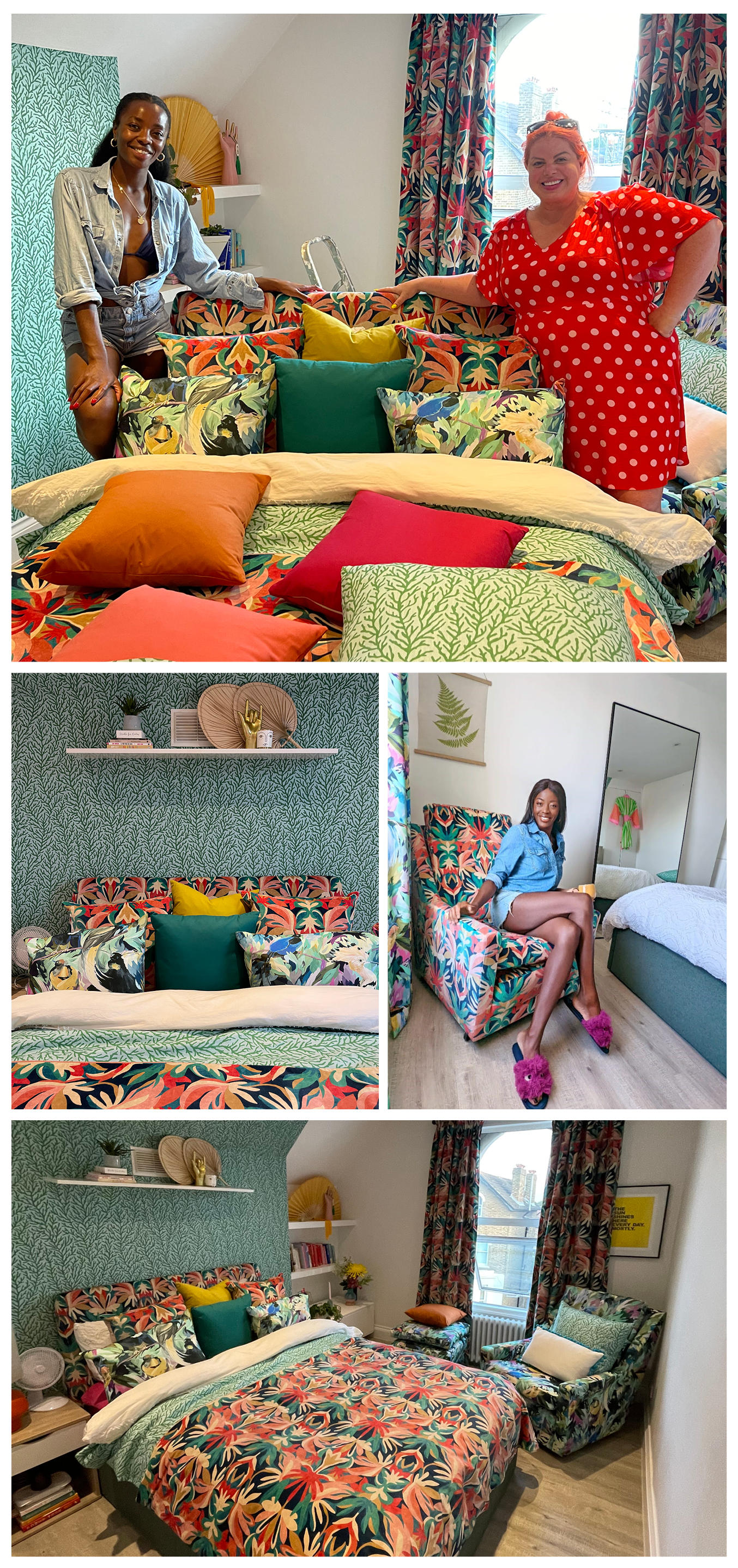
Interior designer and digital creator, Siobhan Murphy, has transformed TV Host and Strictly star AJ Odudu’s London bedroom into a vibrant expression of character and personality.
Siobhan Murphy @interiorcurve rose to prominence in design after featuring on Interior Design Masters and has gone on to forge a vibrant career in design, bringing her own love and passion for colour into people’s homes.
With Rewild her out-and-out look as discovered at Harlequin, we spoke to Siobhan about her work, including how she embraces and plays with colour, and how AJ’s London bedroom went from calm neutrals to flamboyant and rich colour and pattern.
A little about you, Siobhan…
I studied fashion and accessories at Leeds College of Art and I’m a trained milliner. I’ve always loved fashion and love making my own beautiful hats, fascinators and jewellery. For me, interior design was a natural transition - there is so much synergy between the two when we think of colours, fabrics, prints, textures, shapes and trims!
Buying our beautiful Art Deco house three years ago gave me the kick start I needed to really pursue interior design as it gave me the canvas I had always dreamed about to experiment with my ideas and let my imagination run wild.
You were selected to feature on Interior Design Masters as well…
The interior design community on Instagram has been an amazing source of inspiration for me and also a great place to share my interior design journey. It was through my DM’s that the Interior Design Masters casting team reached out and asked me if I wanted to apply for the show, and of course, it was a big fat yes from me! Filming the show was such an amazing experience, I learned so much and gained so much experience in so many different areas of the industry.
You then went on to design for Strictly star, AJ Odudu
Meeting AJ and helping her with a beautiful bedroom at her home was such a fun project, turning her bedroom into a really vibrant space with stunning wallpaper and bespoke soft furnishings made with the most wonderfully patterned Harlequin fabric.
At Harlequin, we love everything about beautiful colours and patterns. How do you use colour boldly to connect with your clients?
All my clients know that I love colour, pattern, and print so I haven’t had to design any minimalist homes just yet! I really enjoy exploring colours and patterns with clients, finding out the colours and patterns that spark joy for them but also considering what will work best in their space too. I think my job as an interior designer is to create spaces that make people feel something, so my first question to my client is how do you want to FEEL in the room? Relaxed? Energised? Calm? Happy? Restful? I start with a feeling and go from there. Colours are so important when it comes to how we feel in a space too, so it’s important to get that right. I like to push the envelope so I will always encourage my clients just to go for it, the bolder the better!
What does colour in interiors mean to you?
Colour means everything to me, and I love to fully surround myself with it at all times. I think adding colour to a room is the most transformative thing we can do and that could either mean painting or wallpapering the walls or something like adding a pop of colour in the soft furnishings such as rugs, curtains, cushions and throws. In my life colour is so important, I see colour combinations wherever I go and I’m inspired all the time, in nature and travel especially. I then relate these back to interior design thinking about how they could work best in a room design. Colour makes me happy and I love clashing colours together; some of my favourite combos at the moment are lilac and chartreuse, pink and red, yellow and turquoise, and blue and orange.
How has your own sense of style, in life, fashion and interiors, evolved and how do you truly own it?
It has certainly evolved over the years. In my last house, I had quite a dark aesthetic with black walls, dramatic artwork and pops of colour in the furniture, but when we moved into our current house I really wanted to pay homage to the Art Deco architecture and create an interior that enhanced the original features, I call it Heart Deco - Art Deco with a modern twist from the heart. My fashion sense and how I design are always 100% me, I don’t follow trends or listen to so-called interior rules. My spaces are full of happiness and joy, that’s what design is all about for me.
We’ve written a Whitepaper on the physical and emotional responses we have to colour and light and why – do you have a colour you’re drawn to and do you know why?
I’ve always been drawn to pink. Pink is my happy colour and I love it in all its forms, baby, salmon, cerise, barbie, blush, flamingo, rose, magenta, fuchsia. I adore them all. Both my wardrobe and my own home are packed with pink for me it’s calming, it’s pretty and I like how it works with my botanical murals, animal prints and other colours in my home.
How did the transformation of AJ’s bedroom come about? It was very neutral before!
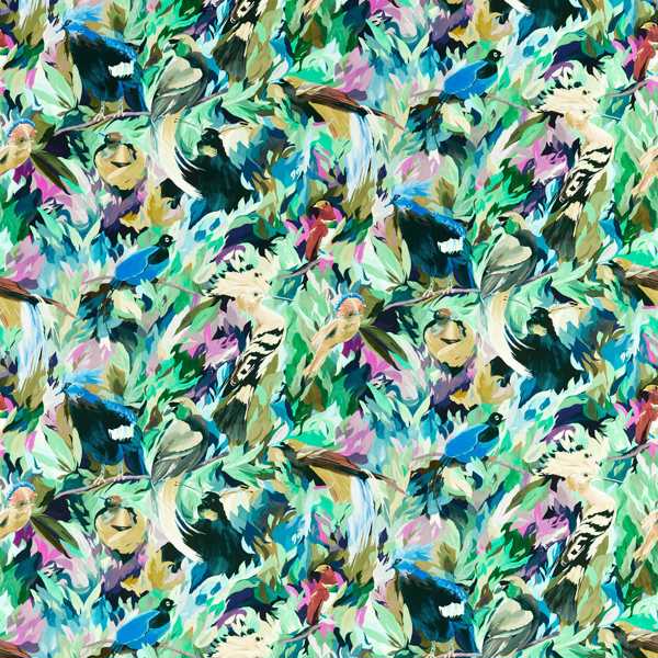
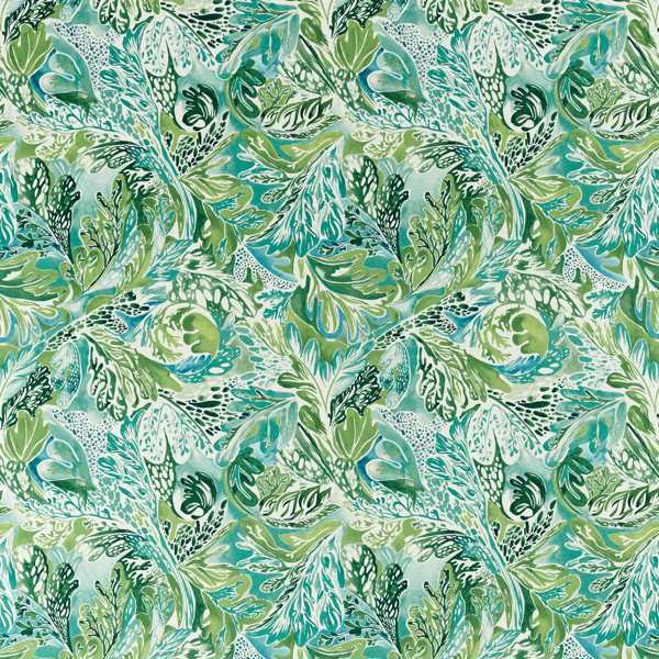
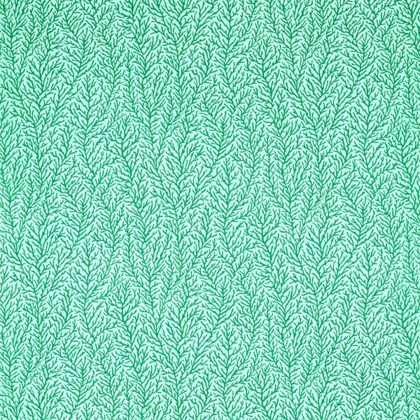
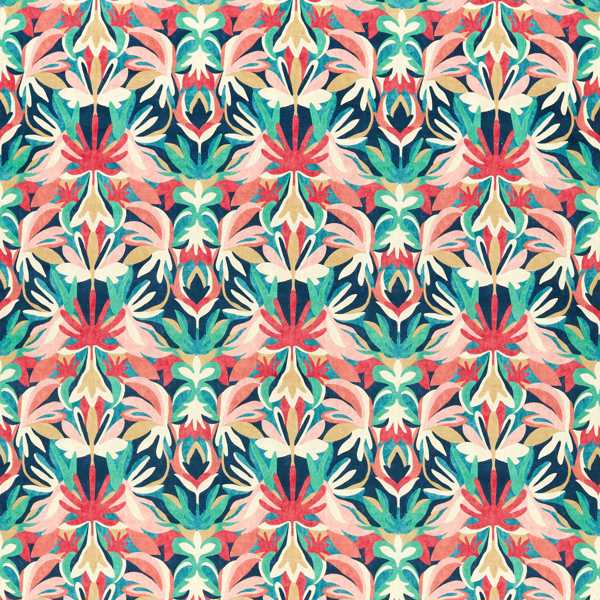
AJ is a fellow colour lover and has a great eye for interior design so when I saw that her bedroom was very neutral I knew that we could do something fabulous together to transform it into the bedroom of dreams! We worked together to choose some beautiful fabrics and wallpaper that all worked together harmoniously. My friend and fellow IDM designer, Micaela Sharp, sourced a vintage chair for me and reupholstered it in Dance of Adornment from Harlequin, giving it a new lease of life. Micaela also recovered the existing plain grey headboard in Melora, giving it a fresh new look. Bespoke curtains (also in Melora), throws and cushions (in Atoll and Dance of Adornment) were all made to give the room a really luxurious boutique hotel feel. We wallpapered the feature wall behind the bed in Atoll and kept the rest of the room a fresh white to really keep everything super bright and modern.
What drew you and AJ to the Harlequin designs you choose to use in the transformation?
I really wanted to use fabrics that were colourful, interchangeable and vibrant. Picking three very different patterns but all with a similar colour palette meant that the fabrics all worked together and gave the room a luxurious and cohesive look. We only wallpapered one wall, so it was amazing to see such a transformation just using fabric to transform the soft furnishings. What a difference, I think it looks amazing!
The designs you selected were all from our REWILD look. If you had to describe someone who embraces REWILD, how would you paint that picture?
To me, the whole collection paints a picture of someone who just goes for it, who doesn’t follow the crowd and isn’t afraid to experiment. Someone who loves colour and pattern and wants to create a joyful space in their own home. Someone who loves luxurious fabrics and maybe even has a wild side that needs to be unleashed every once in a while!
We want to empower people to be more colour confident and express themselves in their own homes – to really own the room, what advice would you give people looking to express themselves through home design?
People always ask me how they can be braver with colour and pattern in their own homes and I always ask them to start by pulling together some inspiration; have a think about what colours and patterns you are drawn to, maybe have a look in your wardrobe as a starting point. I always encourage people to pull together a moodboard, use Pinterest and pin all your ideas, then refine and refine until you have a design you are happy with. Order paint chips, fabric and wallpaper samples and see how they all work together before deciding too as colours can look different in different lights and at various times of the day. Our homes should reflect our personalities, so I always say if you love it, it can’t be wrong!
Love Siobhan’s expressive use of bold colour? Follow her @interiorcurve You can also find Siobhan’s bold sense of style in her new 60-piece decor range, her book ‘More Is More Décor’, presenting interior segments on Steph’s Packed Lunch, and in her interior column in Ok! Magazine.
MORE FROM HARLEQUIN
Learn about the science of colour in shaping and expressing who we are, through Harlequin’s specially commissioned White Paper, here.
#Owntheroom is all about you. Take our Own the Room Quiz and discover a style that reflects you.
Order samples and start your own colour journey at Harlequin.
GET THE LOOK
posted on 14 Jun 2022 in Interiors
