At the kitchen table with Sophie Robinson
Sophie Robinson’s maximalist mantra knows no bounds when it comes to designing her countryside home. Step into her kitchen with Harlequin and sit down for a chat as we discover the space from mood board to heart of the home.
We all know that the kitchen is the heart of the home and its parameters are ever expanding. Once a humble place of food prep, with separate dining spaces that housed the formal furniture, now these rooms collectively rejoice in a conversational, functional space that welcomes and embraces everyone who steps over the threshold.
With this, rather hefty brief of feeding, watering, welcoming and entertaining, bestowed upon the hub of the home, it seems fitting that it should be filled with character, colour and life, a reflection of the breakfast table, bursting with flavour and buzzing with character.
Sophie Robinson, creator of joy, protector of the power palette and designer of maximalist wonder, joins us at the proverbial kitchen table, to chat about the design of her own kitchen and dining space at her countryside home, and how you too can get maximalism just right in the busiest room of the house.
Tell us about your original kitchen diner…
We flipped the kitchen and living room spaces because the original proportions felt unbalanced; we started out with a large living room to the rear of the house and a little kitchen at the front. We spend all our time in the kitchen and less time in the living room, so it felt right to flip the spaces and maximise on their square footage and natural light. This switch was full of opportunity as it allowed us to create an open, bright and joy-filled kitchen that faced our cherished garden and created a beautiful, cosy TV snug at the front of the home, to retire to in the evenings. The reconfiguration for me was all about challenging the assumptions of this old house. The slightly old-fashioned, grand living room that no one ever really sits in was given new life in the form of our kitchen and dining space, where we have a luxuriously large dining table to gather around and beautiful patio doors that take us out onto our garden for dinner outside.
What was the story you wanted to tell in this newly configured space?
The story always begins with asking questions, how will we use it? Who is using it? What are they doing in there and when are they doing it? We all have different habits and different ways of living in our homes, but for us, the kitchen and dining area was destined to bring everyone together, family, extended family, friends. Everyone. It’s a social space, it’s practical, we cook, we store food, we entertain and hang out. It’s a very hard-working space. The kitchen benefits from a huge amount of natural light. It is so joyous and uplifting and the design tells that story. It is a place of celebration, connected to the garden and the woodland beyond our patio doors.
Tell us about the designs you selected and how you opted to use them?
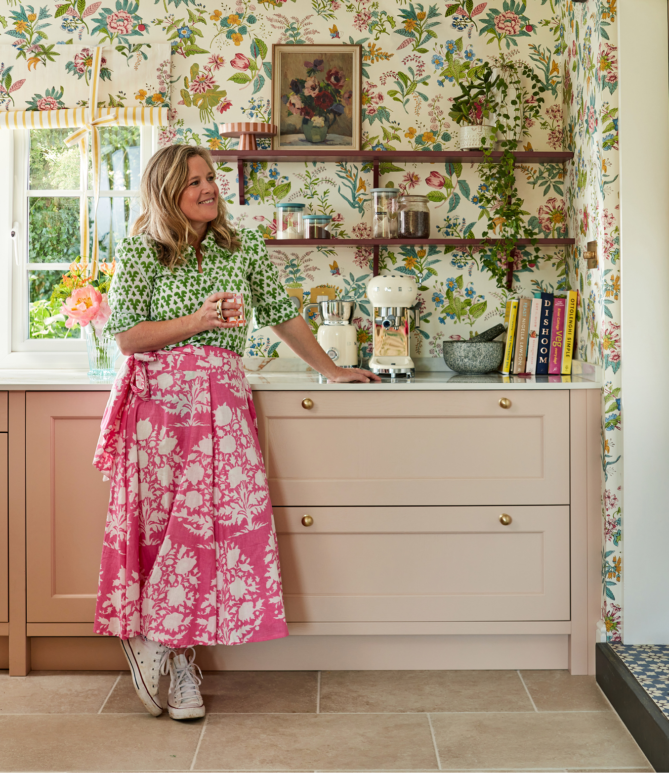
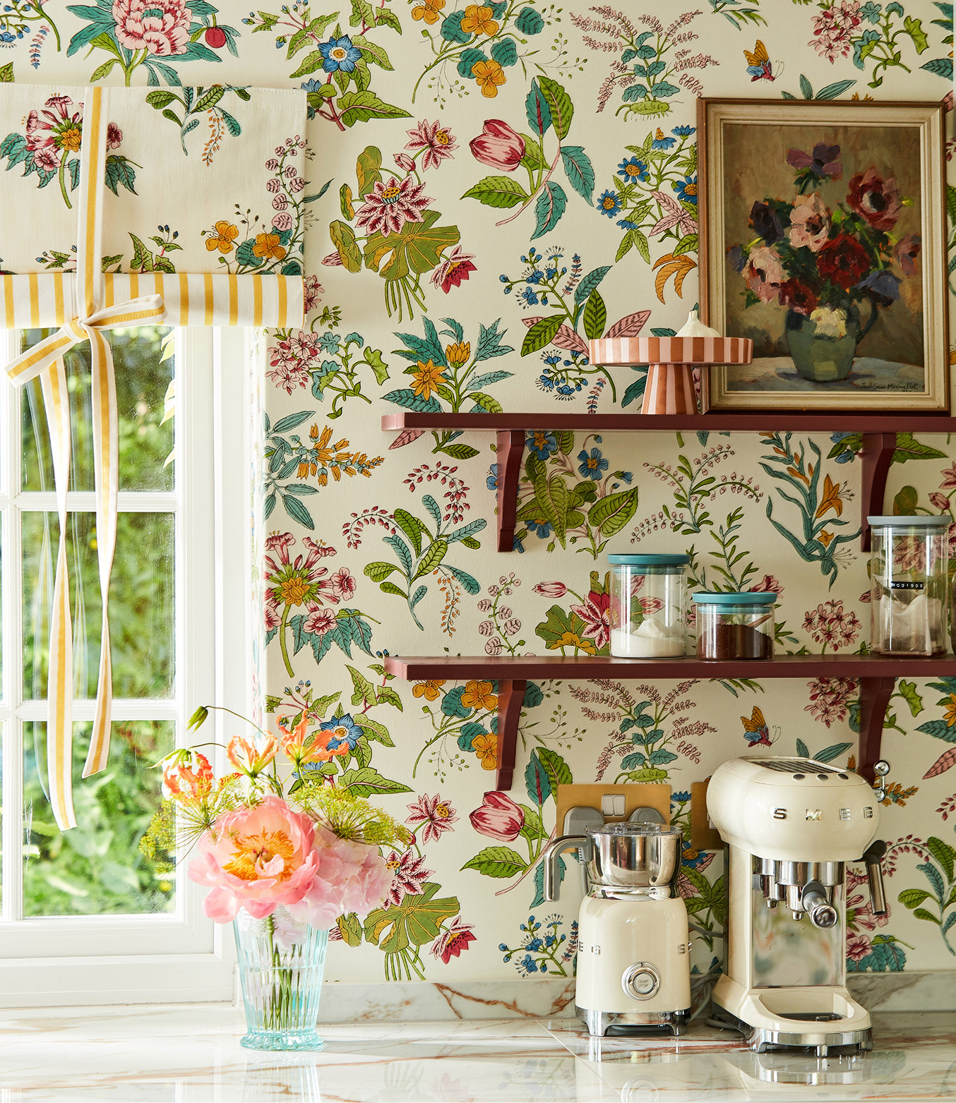
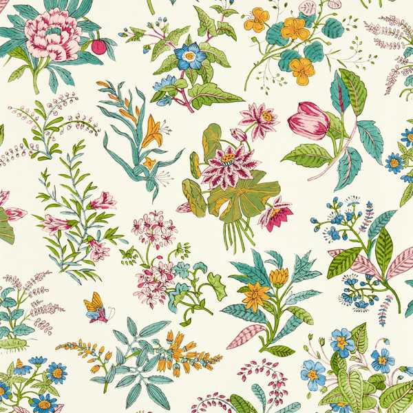
Woodland Floral is a busy design. Within it is a lot of movement and colour. In this kitchen, there isn’t a huge amount of wall space on show as there are a lot of cabinets. Using Woodland Floral as a wallpaper worked because its peeks out from behind shelving and around the fireplace in a really charming manner. It dances around the room, either side of the curtains, catching glimpses in nooks and corners. I also love the fact that Woodland Floral shows the exact flowers that are outside in my garden.
My garden is such a beautiful view to behold, so a strong geometric like the Paper Straw Stripe really frames the view in curtain form. I love a stripe and a floral paired together. I like the friction of one loose and elegant design and another strong and bold, and this is what you get with Paper Straw Stripe and Woodland Floral.
How do each of the designs and their colourways, speak to the space?
I started with Woodland Floral wallpaper design as the basis of my mood board. It gave me my palette and from that I chose the yellow, pink and I gradually added in the deep red, which has a very earthy brown tone to it. All these colours have a huge amount of warmth in the palette.
Maximalism is inherent within the kitchen, from the stacks of mugs to the endless collected jars, bowls, and bottles. How do you bring maximalism to such a busy space while maintaining that feeling of togetherness?
Colourful kitchens are being embraced now and I have chosen harmonious colours that give it coherence and harmony. Keeping the colour palette tight helped with this space immensely.
My advice is to not hold back. One of the last things I chose was the worktop. Originally, we considered a very plain white one, but the heavily veined marble, with hints of orange running through, ties in perfectly with the whole scheme. It’s that layered approach, the mixing within your interior space, that gives life to maximalism. Layering pattern, from your wallpaper to your blinds and curtains and even your worktop helps to build that maximalist narrative. You can be experimental, as long as the colours share the same tone.
My boldness in this process has paid me back in spades. Everyone comes to visit to see the kitchen. I am doing cartwheels in that space; it is everything I want it to be.
EXPLORE THE DESIGNS
GET THE MAXIMALIST LOOK


posted on 11 Sep 2023 in Interiors