Harlequin Reimagines Colour with Maddox Gallery
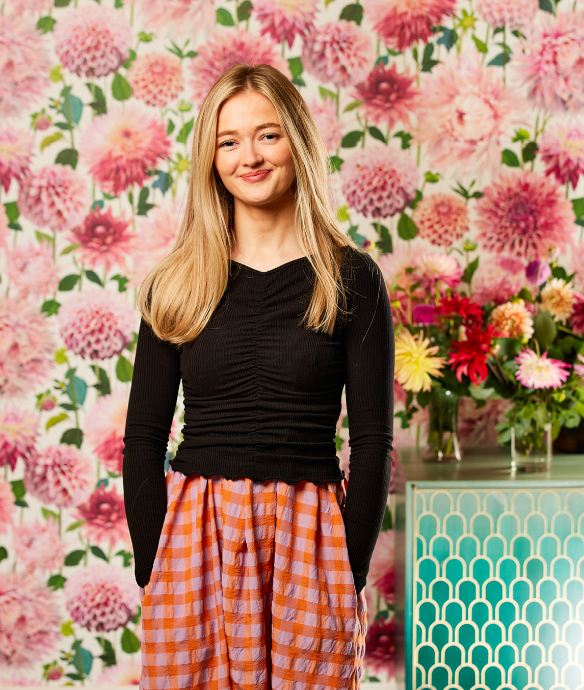
“Right from the offset, we realised this was an amazing opportunity to use colour in a very different way”, says Flora Daly, speaking about Harlequin’s collaboration with London’s Maddox Gallery.
Bright, bold and statemental, the gallery’s new ‘Reimagining Colour’ exhibition introduces an uplifting collection of leading abstract, figurative and colour field artists. Running until the 12th March, it’s a beautifully curated space, with joy and colour confidence at its heart.
Harlequin designer, Flora continues, “Collaborating with Maddox in this way has been really exciting for Harlequin. Understanding the science behind colour is something we consider every day, so helping to curate the colour narrative for the artists’ work has been a privilege. Increasingly, galleries are transforming into immersive spaces, allowing visitors to connect with artworks in a more engaging way. We hope the paint colours we have selected enhance the viewing experience for this insightful exhibition.”
With offices, design studio and factories located throughout the UK, Harlequin is a proudly British brand. From its Loughborough studio, the Harlequin team is well known for using the power of contemporary colour to design fabric and wallpaper which can be used, much like artwork, in all styles of home. With colour playing such an important role in the design process, this fundamental connection between colour and art is both inspiring and enticing.
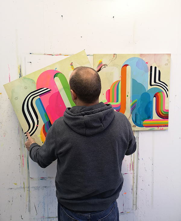
The Reimagining Colour Exhibition focuses on four artists: Nick Grindrod, Dairo Vargas, Melissa Herrington and David Pher and uses Sanderson Paint, from one of Harlequin’s sister brands.
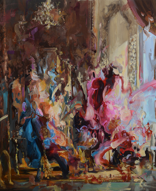
DAIRO VARGAS
A contemporary, fine artist, Dairo draws influence from the Renaissance and Baroque periods to cast a connection with our behaviour and modern society. Our colour choices suit his design style allowing his work to speak by pulling out elements, whether vivid or slightly softer.
Wall colour: Rowanberry and Inkwood

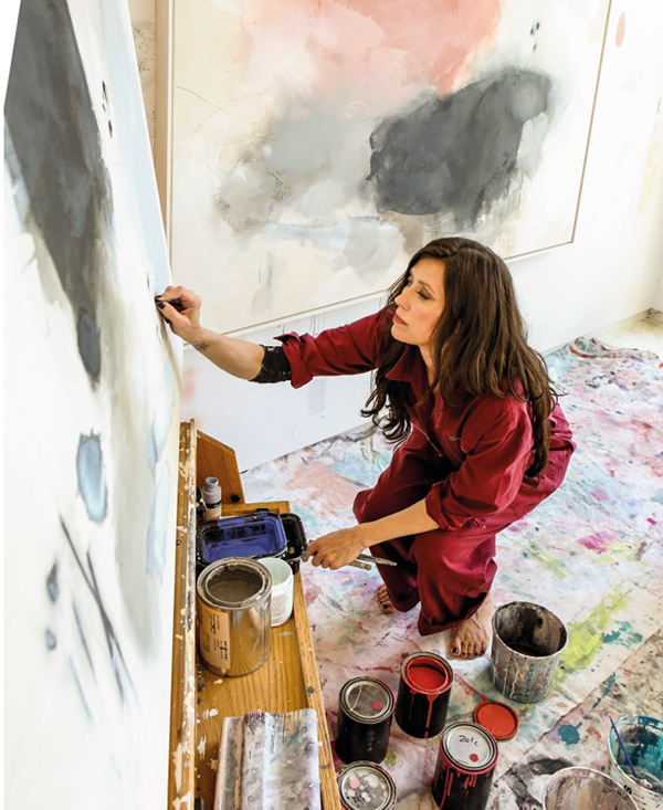
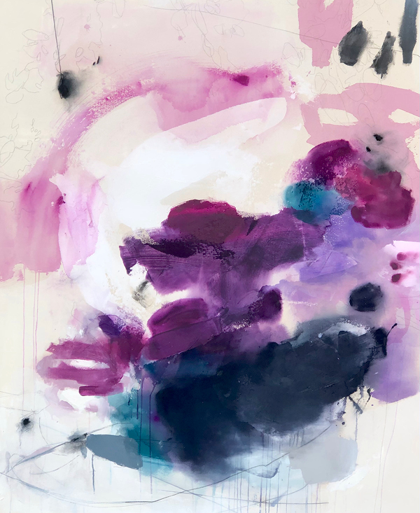
MELISSA HERRINGTON
With her large scale abstract paintings built up through layers of paint on canvas, overlayed with graphite, charcoal and pigments, Melissa is an abstract artist based in the US. Her beautiful colour combinations pair wonderfully with our muted and moody paint choices.
Wall colour: Woodland Yellow, Blue Clay, Oxney Olive and Wortle Lt
DAVID PHER
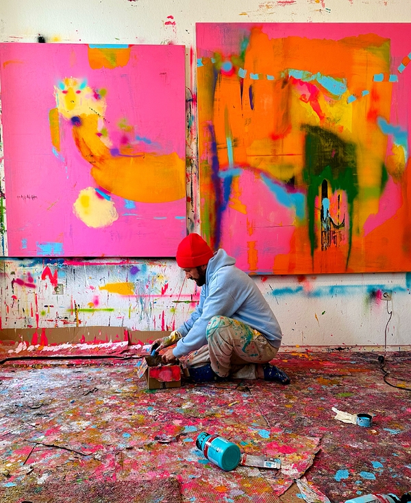
David’s abstract pieces are a vivid assemblage of intense colour, sharp contrasts and daring compositions, emerging from an interplay of intention and craftmanship. We are excited to see the genuine connection between colour and detailed art in a way that doesn’t compete.
Wall colour: French Rose, Egg Plant, Ming Gold
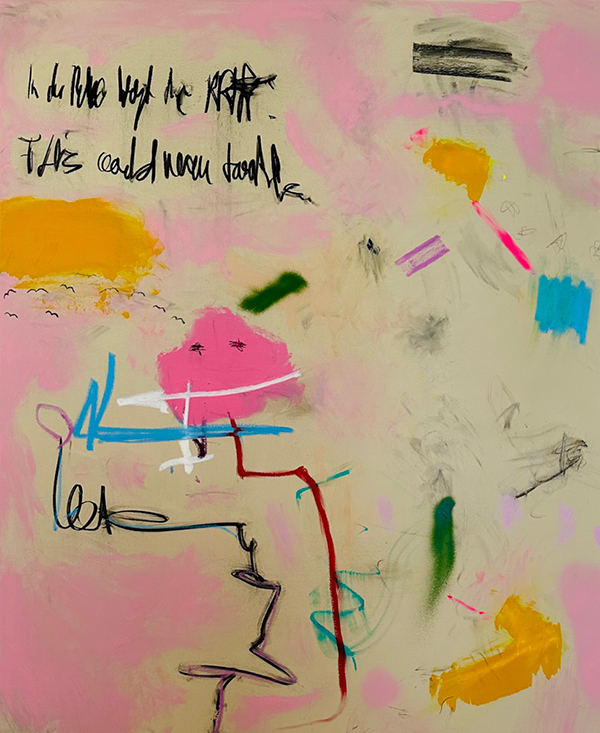
NICK GRINDROD
Inspired by the Young British Artists (YBA) of the 1990s, David’s brightly coloured work pops against a predominantly neutral palette. We pulled out colours from his designs to accentuate the mark making in a contemporary way.
Wall colour: Balmory Blue and Botanical Green
posted on 06 Feb 2023 in Interiors