Colour on the mind with Michelle Ogundehin
From fiery red to restful blue, design expert, author and tv presenter, Michelle Ogundehin, explores how and why colour makes us ‘feel’.
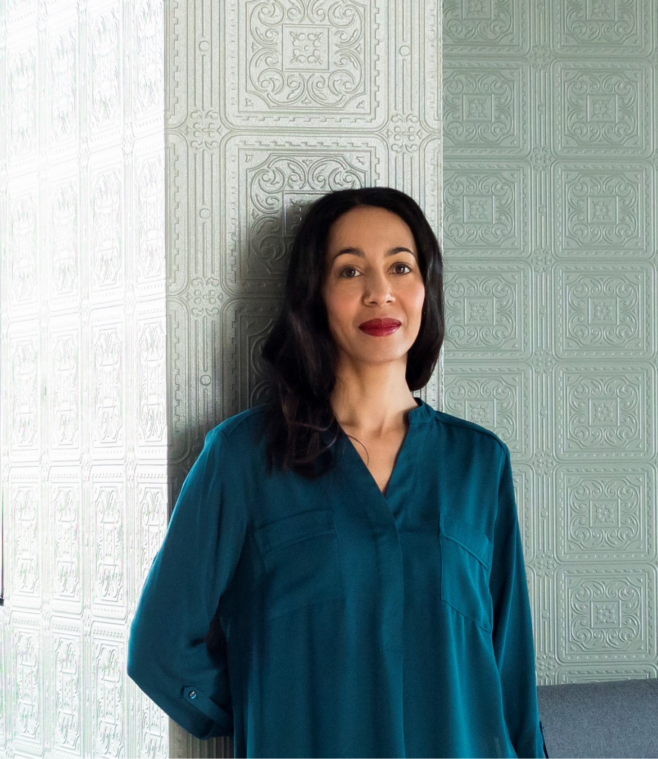
Michelle Ogundehin is a renowned authority on interiors. The magazine editor, author, creative consultant and TV presenter is a proponent for harnessing the power of design in the home for a happy, positive and healthy life. She is also a big fan of cleverly used colour, as often demonstrated and discussed on the latest series of the BBC’s Interior Design Masters. Here, Michelle reflects on the psychology of colour through the spectrum and how we understand and interpret it in our homes.
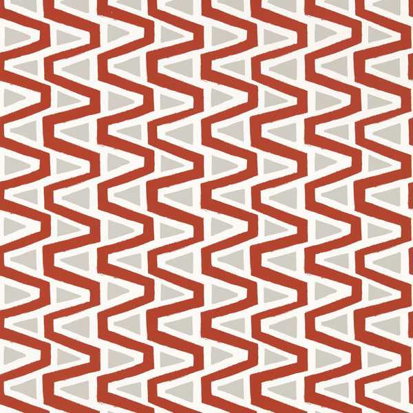
“I think the best way to understand colour is to imagine each hue as an emotion. In other words, when we use a certain colour in a space, it can promote or provoke the associated feeling. For example, red is commonly perceived as hot, fiery, and provocative. It’s a ‘sit up and notice me’ colour, hence its use for warning signs and shopping discount flags. It is also why red lipstick is such a statement and robins so revered.
“In truth, we’re hardwired to respond to red because its perception transcends the thinking part of our brains to mainline straight to our primal cortex. In other words, this primary colour fires a primitive reactive response — feelings of anger or frustration at one end of the scale right through to sexual allure at the other. Think ‘seeing red’ to red-light district. And why it’s usually contained as an accent colour in most homes.
“However, dilute the red with white and you immediately subdue the action. In fact, American studies have shown the calming effect of pink to be so effective that it’s been employed in prison holding cells, visitor’s locker rooms at college football stadiums and in small-town ‘drunk tanks’. In contrast, deepen and darken it with its chromatic opposite, blue, and this range of tones — violets through to burgundy — are said to encourage concentration and study.
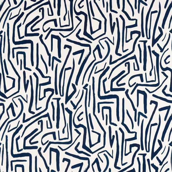
“Such a response is completely logical. Blue triggers an entirely different part of our being; the imagination. It intuitively recalls blues skies and deep seas. It is restful for the eyes and soothing in domestic application. It is an introspective colour; it permits space to think. Even in its overtly primary iterations, like a bright Cobalt or Azure blue, it does not shout. It calms, but in a different way to pink. The latter sedates, blue inspires.
“It is, of course, a close cousin of green. Sited at the very centre of the visual spectrum, quite literally less energy is required of us to ‘see’ it. No doubt this contributes to green’s proven ability to lower blood pressure and soothe the nerves. Indeed, hospital patients are reputed to heal faster with views out over a garden. Add in the obvious associations with new growth and renewal and the case is made. Fact meets perception.
“There are many undertones and variants of every single core colour, but the chromatic mathematics is still straightforward. Simply put, from your base, add red for heat; blue to cool; yellow to warm; green to calm. From there, combine with white to subdue, or black to intensify.
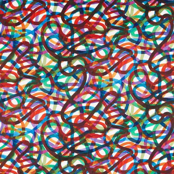
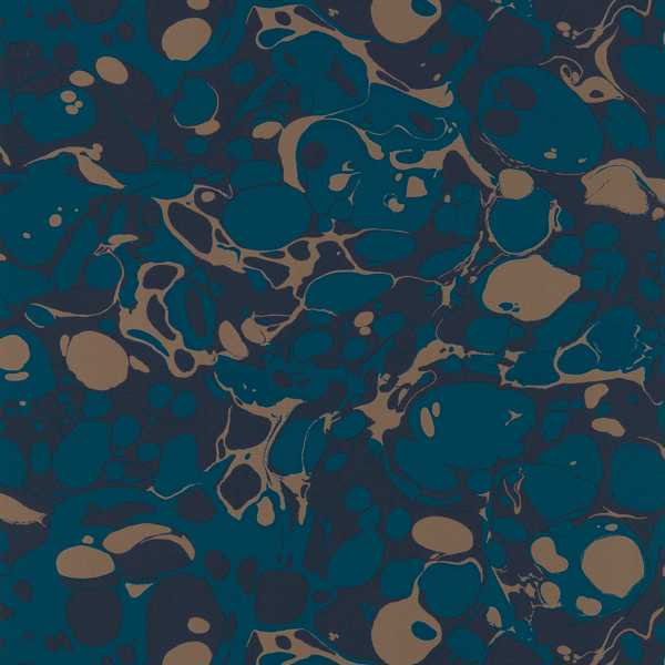
“Personally, I adore what I call ‘dirty’ colours, that is colours knocked back with a gentle dose of grey. Think dusty pinks and sage greens, lemon yellows with lavender, and every shade of the English sea, greige to pale blue. I find them impactful yet soothing, in part because they know their place as backdrop to the lives lived within their embrace. What’s interesting is that psychoanalyst Carl Jung apparently once said, “Colour is the mother tongue of the subconscious”. I wonder, then, what he’d make of my favoured palette?”
Like Michelle’s take on colour? Follow @michelleogundehin on Instagram or check out her website michelleogundehin.com
PHOTO CREDITS: BEN ANDERS
MORE FROM HARLEQUIN
Learn about the science of colour in shaping and expressing who we are, through Harlequin’s specially commissioned White Paper, here.
Take our Own The Room Quiz, and discover a style that reflects you here.
Click here to order your fabric and wallpaper samples and start your own colour journey at Harlequin.
DISCOVER COLOUR 2
posted on 06 Jun 2022 in Interiors